Thursday, 17 March 2016

OUGD502 - Studio brief 1 - Creative Report Design

For Studio Brief One, I produce an outcome that was quite personal. 

Confidence is something I find daunting to express, however, over the year, I managed to grow and fight through that struggle. Especially when it came to engaging with other professionals and getting responses such as this for the Creative Report. I produced a concertina publication that quotes of Ricky Richard's advice. Although I left it quite late, I managed produce an effective design which is really personal to me in over coming confidence.

OUGD502 - Studio brief 1 - Creative report


I took time to speak to 2 creatives after they presented at the future rising talk, this was lucky for me because I was struggling to engage with professionals before hand I wasn't too confident. So when coming to the creative report I felt my outcome wouldn't be so great. Saying that I have definitely taken a lot on board from doing the creative report brief, it has allowed me to step out of my bubble and to connect with the outside world.

I spoke to Ricky about confidence as that was something he brought up in the talk, It definitely related to me as it's something that holds me back within the course. So I asked him what his thoughts were on overcoming confidence and I got an essay of a response, which actually made me feel a lot better and given me the motivation to engage more with people like this. 


I spoke to Jack Hone about his journey after graduating, I wanted to have an understanding of what to expect when I also leave. It was also interesting why he decided to become a creative. It's always intrigued me on how people figure out their talent and interests as a career. Unfortunately on my behalf he went on holiday before I managed to get a reasonable amount of questions out of him, having said that I know I've learnt a lot about engagement within the industry, I want to continue my networking with professionals and hopefully it'll benefit me long term when getting experience in the industry 

OUGD502 - Networking - Linked in


OUGD502 - Online Portfolio.


Wednesday, 16 March 2016

OUGD502 - Study task - Summer Evaluation

My Graphic Summer

Over the Summer I visited a fair amount of festivals, such as Parklife, Cream fields, Wireless and Mint Festival.  I worked most of them but I was still able to explore and enjoy myself. Whilst there I came across a lot of Visual communication, the visuals would consist of a promotional setting. These settings would either be electronic visuals on the main stages, which would be the identity of the artist. To Red Bull paying the festival to promote their brand in ways of keeping the Red Bull fridges full and doing the perfect serve, This serve would be to apply only a full Red bull can into a Red Bull plastic cup. If this were done to good standards we would be treated with free Red Bulls throughout the shift. This allowed me to think broadly into the importance of advertising, for Red Bull would pay hundreds of thousands just for Park life to use there mixer. 

Overall Parklife had to be my most favoured festival as it had commercial acts and the decorations were effective in the sense of park life exploiting there brand all over with a peculiar space/jungle theme.
I liked how when purchasing the ticket online the images on their web page had a vintage vibe, like the old theatre tickets/bus tickets. That vintage look would specifically connect with the tweed pattern within the typography. The fact everything connected together brought an interesting atmosphere.


These strategies were replicated from the website to the decorations on the field, for example they expressed their identity through typography and a specific colour scheme, pink and white with a pattern fill which was placed on the field for people to interact with and to take pictures of the huge Park life typography. This would be a cheap effective way of promotion, as the custom would use social media such as Instagram to share their amazing experience #hashtagging.   


There would be a variety of themes all over the festival, as certain acts would be playing on the stage. A DJ called MK was placed within a jungle setting I think this relates back to one of his songs, ‘My head is a jungle’, these are the visuals I considered whilst being apart of the experience.

Reflecting on the festival if I was to create the theme I would consider introducing a more mutual colour that would represent both genders. But as a positive for the chosen colours I do think the pink and white works very well for standing out.  

I personally would be very interested in creating the visuals/theme for a festival, as the development stages would be fairly similar to my practice. Knowing you can actually help organise and create artwork for Parklife would be something I might consider applying for next year. I feel it would give me the confidence and push I need.

OUGD502 - Study Task - Taking Care of Business - Logo

This logo was designed by Rens, which we went forward with. The soft typeface allowed a friendly feel to it, using the 'O' effecitve in representing the sunrise. I personally think the word Moguh in that particular format stands out massively, especially because its a foreign word. 


"As mentioned by having something ‘personal’ or ‘specific’ such as your name is 
a good extendable identity and as I mentioned this is what ‘SNASK’ did and as was mentioned the ‘smile ability’ element in trying to get the name pronounced correctly is a good one"

This comment clairified that our idea proved successful, we wanted an interesting name that would be remembered & be easily recogised. We also wanted it to be different such as 'SNASK' a name which you wouldnt understand but sounds exciting. 

OUGD502 - Study Task - Taking Care of Business - Logo development

We set out a task for each of us to design our own logo for moguh, then to present our final design to the rest of the group. This would allow us to crit each others design and select the one that best represents Moguh 

When developing the logo, I wanted to incorporate a sunrise through the use of the 'O' creating a friendly approach with our business name for Moguh isn't English it's Dutch for (Good Morning) so pronunciation wasn't always correctly said. 

Other than that I also wanted to involve a smiley face within the logo linking back to its friendly vibes


Sunday, 13 March 2016

OUGD502 - Presentation


My outlook on life, influences who I am as a designer.  
For example, the change in my fashion has developed a growth in the way I create. Vice versa.
This year, I have understood my style more clearly and gained skills that have helped me to produce monochromatic modern and aesthetically pleasing outcomes.


During the first year I was able to discover my abilities within the course, to have an understanding of what type of graphics I wanted to proceed into the second year.
As shown most my work is done digitally, as I’ve always had a keen interest in ITC so approaching graphics in a non-traditional way is a lot more effective to me. 


Looking back at my first design I knew my skills had broadened. The fact I didn’t present the design onto mock ups says a lot. I also feel like it doesn't communicate me visually, although my need to use shape & line consists within my work.


My current business card on the other hand conveys a much stronger representation of myself. My Initials PD, simply being combined into the P. An by Incorporating line brings out my current work style.


For the website, I wanted to mirror my business card & my style. The use of space, shape, order an colour all complements one another an reflects me as an individual and at some point in the future I will launch a website but only when I have branded & promoted myself effectively. 


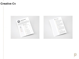
In comparison to my old CV which was simply boring, a lot more common and not very noticeable. I felt placing a different style which involved colour and a much better layout would benefit me more in standing out as well as involving more of my personality. Of course, I would separate information on my current cv to the one I’ll use personally for my career as a creative.

I managed to get myself some client work last year, which definitely allowed me to have a better understanding of how to deal with clients in the future.
Because it was my first time I created too much stress for myself as I didn’t know how to deal with my hourly wage as well as offering a select amount of variations.
Putting in more hours than expected for a client. 


The name Monometri6 is a mix of (mono)chrome & geo(metric), I had to involve a number to make it available but I made use of it an decided to post a design on the 6th day (that being Saturday) 


I haven’t looked into studios as of yet for I am unsure of what direction I want to go in. 
But after working on Moguh I realised I enjoyed taking part in building something. The teamwork & excitement when approaching sections of creating a business gave me a keen interest in starting something myself or as a collective. 

As a creative there is a broad direction in which you can follow so hopefully after the 3rd year I’ll have more of an understanding of what exactly I should specialise in.

OUGD502 - She Was Only - Studio Research

What interested me with this studio was that their work is built around the principles of simplicity, clarity and elegant problem-solving. Because my work is mostly simplistic I'd like to think this studio would appreciate my particular style. The interior of the studio definitely is my kind of environment, Not too much colour but a clean modern appearance.

Also knowing I tick some of their services of work such as branding and print gives me a keen interest in summer experience.


She Was Only
+44 (0) 20 7193 8796
studio@shewasonly.co.uk

She Was Only


Tuesday, 8 March 2016

OUGD502 - Split Studio - Research

Split Studio 

What caught my attention with 'Split' is the simplistic website layout it wasn't over done but directly arranged into a scrolling system on the portfolio, drawing my attention further I began to like the work style which specialises in creative led graphic design for both print and web. 

From taking an in dept interest it has allowed me to warm to the energy split has to offer, The feedback from clients is extremely positive & their acceptance towards interns is admirable 

The fact they're based in Leeds pushes me into contacting the studio for summer placement, as they are open to looking into expanding designers/developers work experience. 

The work created is fairly simple but holds deep thought into the concept of the work presented  


Monday, 7 March 2016

OUGD502 - Study Task - Taking Care of Business

Working in groups of up to 4-5 we were asked to construct an idea of what kind of graphic design business plan or proposal we would present to the peers & tutors.

our plan and presentation should be based on the analysis and content that you have been introduced to throughout the module.

We have been giveM a few questions to what the studio will be built up on and how it will appear to the public

MOGUH Original / Creative / Studio
Means ‘Good Morning’

Team
Paayal Makandai
Daniel Carter
Rens Koolen
Youri van den Hurk
Jessica Lomax
Emma Nicholls

Position
International - Leeds and Eindhoven

The Studio
Creative Design.
Traditional - non traditional 

What is your area of trading (your aims)?
Co-op / Global trading.

Cooperative Company – percentage goes to the company and the rest is split between employers. Later, we would turn into a Limited company.

Who are your targeted clients?
Professionals, companies, people who seek out design for businesses.

How do you price your project?
Varies on task but roughly £50 p/h. 35% of that would go back into the company which would then go down once we are established. We would need part time jobs initially and a loan to start off while also attending fairs etc to sell our work.

What are your terms and conditions?
Cooperative Company. A Disclaimer of Liability. Pricing, for example if the clients wants variations and options. Copyright will be released when full and final payment has been received. Once a contract is sign, must pay the minimum agreed even if the client does not wish to use our designs. Final proof reading is the responsibility of the client and any mistakes will incur additional charges. If there are desired changes then an additional cost will be needed from the client. Once a final has been signed off, the company can not be held responsible financially or otherwise for any errors relating to print, programming or any end product. Ongoing and timely communication with the client is necessary for the progression of the project. 50% of the total bill will be taken upfront at the signing of the client’s contract, and this will have been discussed with the client beforehand so they are aware of it. We have the right to reproduce, publish and display for self promotion and advertisement. If the work produced for a client is used in any way apart from what is agreed, the copyright is void and Moguh will retain the rights to ownership. The relationship between Moguh and the client may be terminated by either parties immediately. The client shall pay expenses up to the termination point.

Future aims and ambitions
Expand as a company to become more global and establish two large headquarters in Leeds and Eindhoven. To be successful. Create a name for ourselves and to be sought out rather than seeking out clients. Expand our client range and form relationships with high end clients. Hiring developers and illustrators etc, to branch out to other areas. Offer different departments but work collectively. We also aim to travel together and work in other countries.

What do you offer as a business?
Interpreting the client's business needs and developing a concept to suit their purpose. Estimating the time required to complete the work and providing quotes for clients. Developing design briefs by gathering information and data through research. Thinking creatively to produce new ideas and concepts. Using innovation to redefine a design brief within the constraints of cost and time. Presenting finalised ideas and concepts to clients or account managers. As we are a large group, there will always be someone who can take on the designs and to contact.

Your team, how are you structured, who does what, WHY?
Paayal – Brand Identity, Logo Design, Layout Optimisation
Pete –  Design Optimisation, Print Production
Jess –  Concepts and Copyright
Danny – Logo Design, Editorial Design, Packaging
Emma –  Administration, Print

Each have our own specialties but work collectively

What market/customer do you see as YOURS?
Advertising agencies. Large print houses. Brand agencies. Signage companies. Book and magazine and newspaper publishers. Multimedia companies including the games industry and web development. Television and broadcasting companies. The packaging industry.

Can you offer something unique?
Experimental and overseas.

How will you let people know you exist, promotion/information?
Social media such as Instagram, Facebook, Behance, linked in etc… Street work such as posting flyers, selling work at fairs. Seeking out clients.

How might you progress from year one to year 3?
Hopefully we will or be on our way to breaking even. We’ll be able to live off what we make and expand our knowledge and skills as designers. Expand our client range and collages. Start internships and give students the opportunity to work for us.

Summing up
We are a Cooperative Collective aspiring to excel further in the design world by building a connection with potential clients globally.

Finance

Fixed Expenses

Patrick studios – £250 per month
Gas/Electricity/Water - £150
Wifi & Telephone - £100
Insurance - £30
Travel (approx.) - £150
Food - £600

Running costs total - £1,280

Start up Costs

Macs – £5995
Adobe subscriptions - £3192 per year
Fridge - £80
Printer - £498
Scanner - £179
Lightbox - £79
Kettle - £15
Clock - £10
Pin board - £27

Total - £10,075


50p/h
35% goes to business = £17.5
We would get £32.5p/h in the first year

For example, Branding brief –
6hrs x 4 days
24hrs x £50 p/h
1200-35%
£420 into the company
£780 to the designer