My outlook on life, influences who I am as a designer.
For example, the change in my fashion has developed a growth in the way I create. Vice versa.
This year, I have understood my style more clearly and gained skills that have helped me to produce monochromatic modern and aesthetically pleasing outcomes.
During the first year I was able to discover my abilities within the course, to have an understanding of what type of graphics I wanted to proceed into the second year.
As shown most my work is done digitally, as I’ve always had a keen interest in ITC so approaching graphics in a non-traditional way is a lot more effective to me.
Looking back at my first design I knew my skills had broadened. The fact I didn’t present the design onto mock ups says a lot. I also feel like it doesn't communicate me visually, although my need to use shape & line consists within my work.
My current business card on the other hand conveys a much stronger representation of myself. My Initials PD, simply being combined into the P. An by Incorporating line brings out my current work style.
For the website, I wanted to mirror my business card & my style. The use of space, shape, order an colour all complements one another an reflects me as an individual and at some point in the future I will launch a website but only when I have branded & promoted myself effectively.
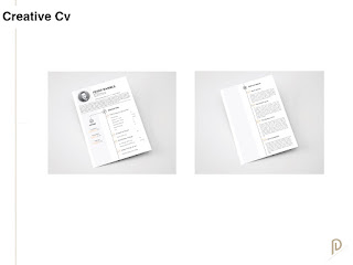
In comparison to my old CV which was simply boring, a lot more common and not very noticeable. I felt placing a different style which involved colour and a much better layout would benefit me more in standing out as well as involving more of my personality. Of course, I would separate information on my current cv to the one I’ll use personally for my career as a creative.
I managed to get myself some client work last year, which definitely allowed me to have a better understanding of how to deal with clients in the future.
Because it was my first time I created too much stress for myself as I didn’t know how to deal with my hourly wage as well as offering a select amount of variations.
Putting in more hours than expected for a client.
The name Monometri6 is a mix of (mono)chrome & geo(metric), I had to involve a number to make it available but I made use of it an decided to post a design on the 6th day (that being Saturday)
I haven’t looked into studios as of yet for I am unsure of what direction I want to go in.
But after working on Moguh I realised I enjoyed taking part in building something. The teamwork & excitement when approaching sections of creating a business gave me a keen interest in starting something myself or as a collective.
As a creative there is a broad direction in which you can follow so hopefully after the 3rd year I’ll have more of an understanding of what exactly I should specialise in.


No comments:
Post a Comment